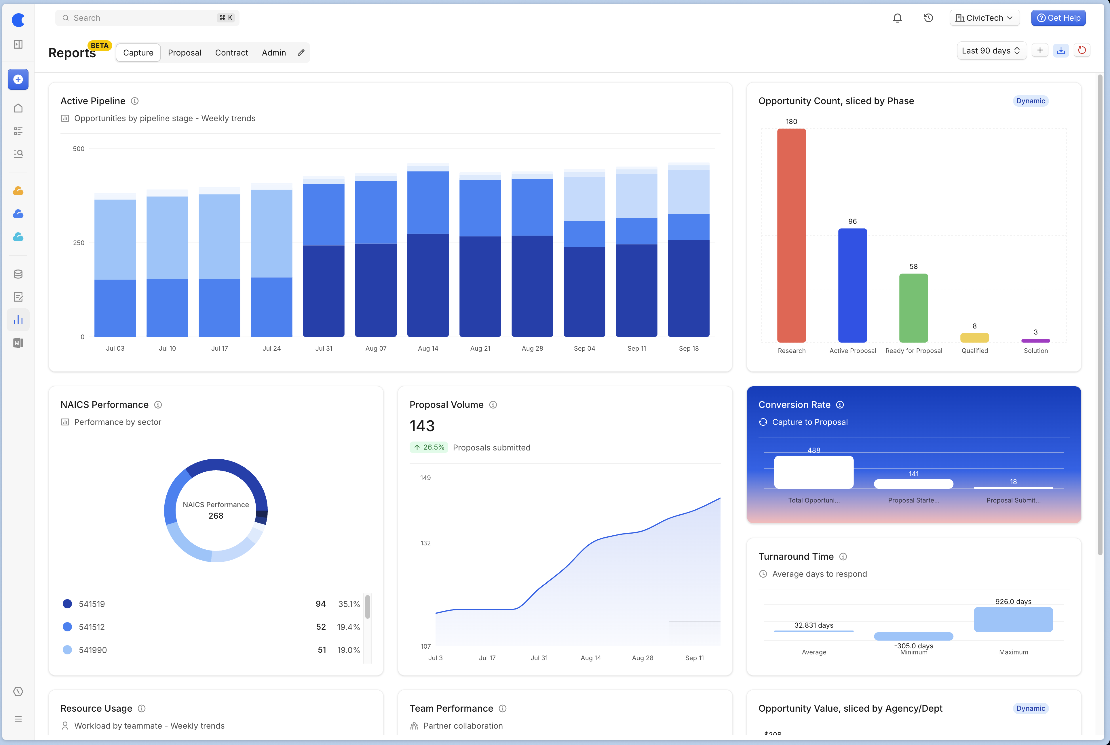
The new Reports experience is an upgrade to our Reporting Center page, offering further customization, deeper insights, and a fresh coat of paint. Compared to the five static views in the Reporting Center, you can now customize the views shown, with granular controls over what data is shown, and how that data is visualized.
Customization and Features
The new Reports Center offers four default views tailored to different units of your business, but you can easily add, delete, or rename views as needed. Each view is highly customizable. You can add widgets to each view, with the following options:
Size options: Small (S), Medium (M), Large (L)
Visualization options: Pie Chart, Bar Chart, Stacked Bar Chart, Time Series
Variant options: Regular or Gradient
Additionally, you can utilize dynamic reporting components as separate widgets. Rearranging your widgets is simple; just use the settings menu located in the top right corner of each widget.
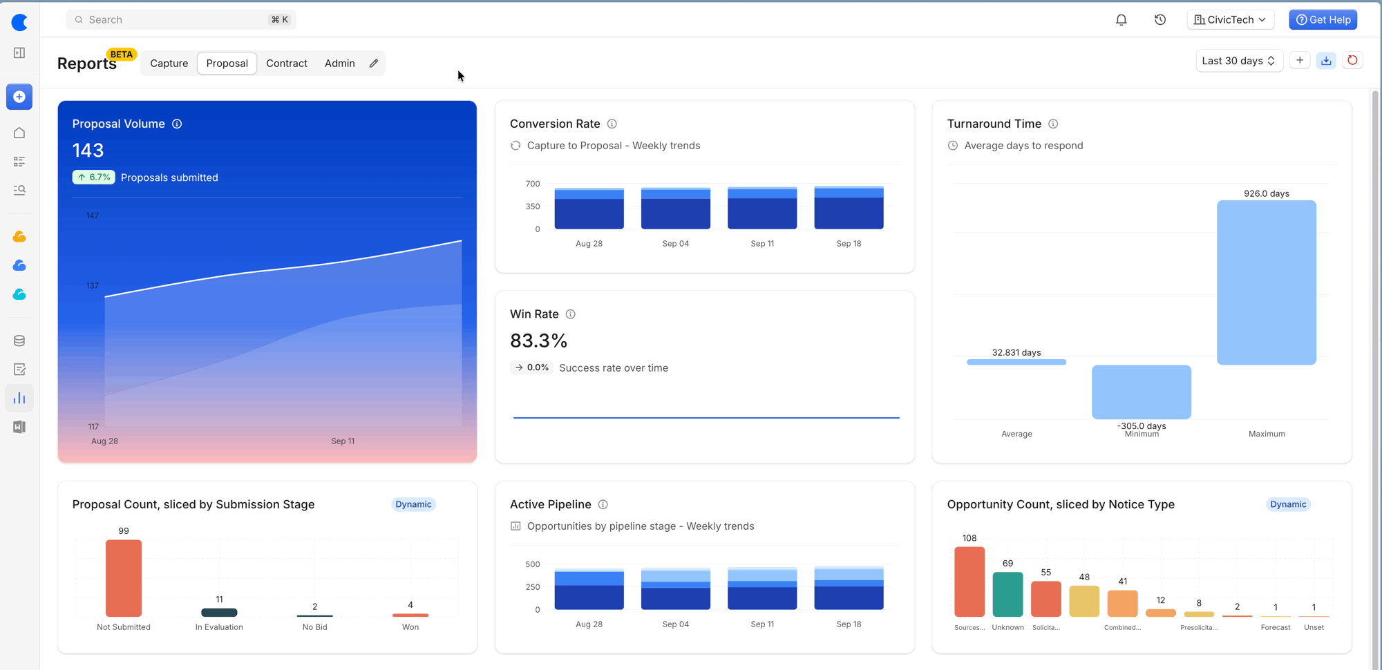
The standard widgets will follow the time period selected from the dropdown found in the top right corner. In contrast, dynamic widgets will display a badge to indicate their dynamic nature; they provide live data that does not adhere to the set time period.
Dynamic Widgets
For information about the metrics displayed in the dynamic widgets, please check out our support article here.
Metric Explainers
The following metrics are available within the new Reports Center. Understanding these metrics can improve your decision-making and strategic planning:
Win Rate: This represents the percentage of proposals won out of those decided (won or lost). It reveals your overall success rate and helps track improvements in your proposal process.
Active Pipeline: This measures the number and value of opportunities organized by your pipeline stages. It enables you to see where work stands and identify stages requiring attention.
Conversion Rate (Capture to Proposal): This metric indicates the number of opportunities advancing to proposal work and how many proposals are submitted. It highlights areas where momentum may be lost.
Proposal Volume: This reflects the number of proposals submitted in the past 12 months, categorized monthly. Tracking this helps assess team workload and trends over time.
Turnaround Time: This is the average number of days from when an opportunity is posted to its due date, indicating the response time given.
Customer Awards: This groups awards by customer or agency, displaying total value. It assists in identifying strong customer relationships.
NAICS Performance: This involves performance by industry using NAICS codes, including win rates, counts, and values by industry, revealing opportunities for growth.
Team Performance: This indicates how each partner performs with you, showcasing wins, win rates, and total value, which can enhance collaboration decisions.
Resource Usage: This tracks the number of opportunities each team member manages and their total value, assisting in balancing workload across the team.
Revenue Timeline: This projects estimated revenue for the next 10 years, combining current contracts and anticipated recompetes, offering a forward-looking view for planning.
FAQs
What enhancements does the new Reports experience provide?
The new Reports experience enhances data analysis capabilities by replacing the previous static Reporting Center, allowing for complete customization of views and dashboards.
What customization options are available in the new Reports Center?
You can add, delete, or rename views, and each view can include widgets with options for size, visualization type, and variant.
What metrics can be analyzed within the new Reports Center?
Metrics include Win Rate, Active Pipeline, Conversion Rate, Proposal Volume, Turnaround Time, Customer Awards, NAICS Performance, Team Performance, Resource Usage, and Revenue Timeline.